This page is a layout study of Tony Zorman’s dissertation-typesetting article. The prose here is new, but the typesetting samples are reproduced from his GPL-licensed source so that the wide figures, ordinary images, and images inside margin notes can be tested in the new Typst pipeline.
The central trick is simple: ordinary screenshots respect the prose measure, while a small number of two-page spreads keep the same left edge and extend through the right margin. On a phone, those spreads return to the width of the text.
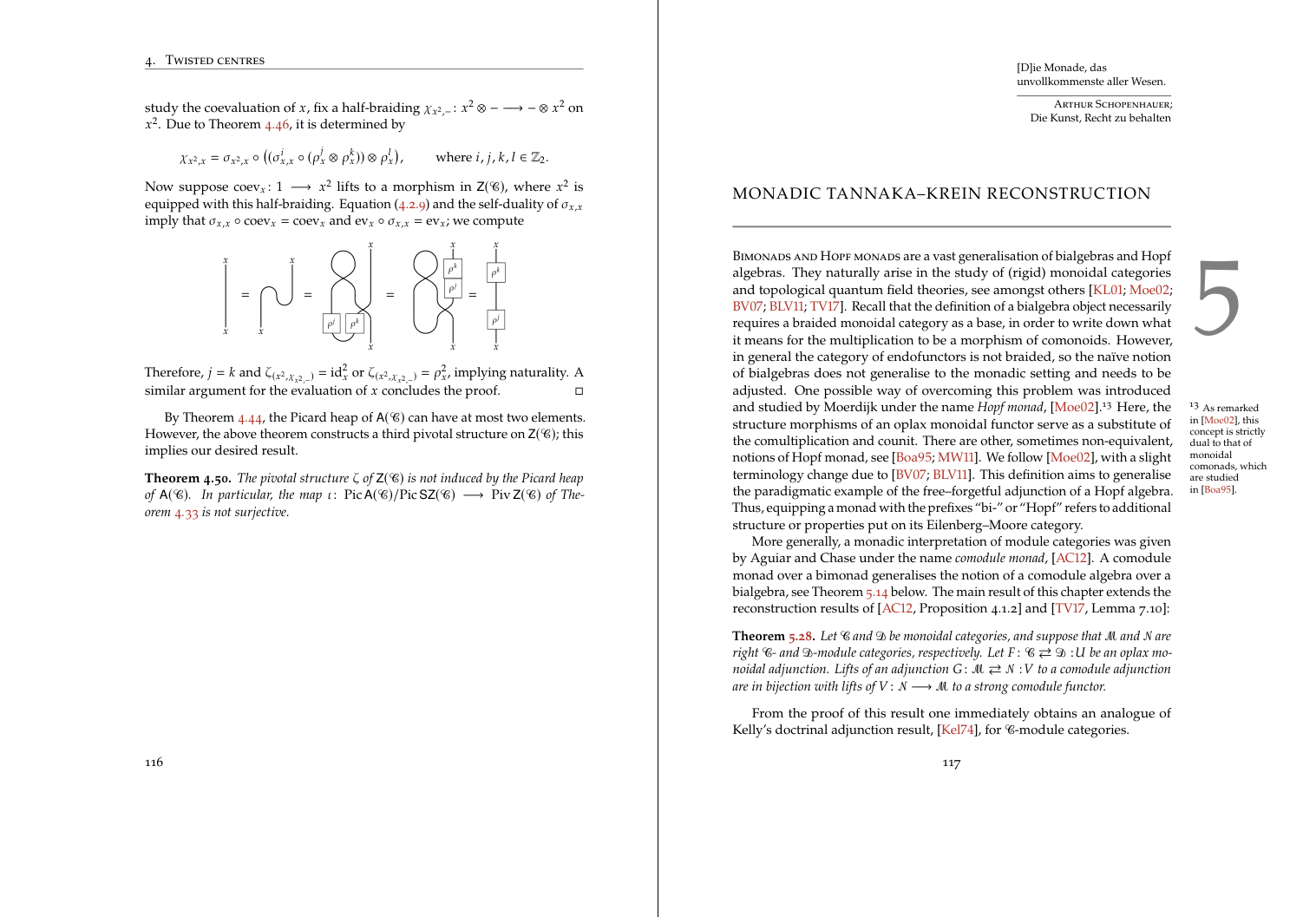
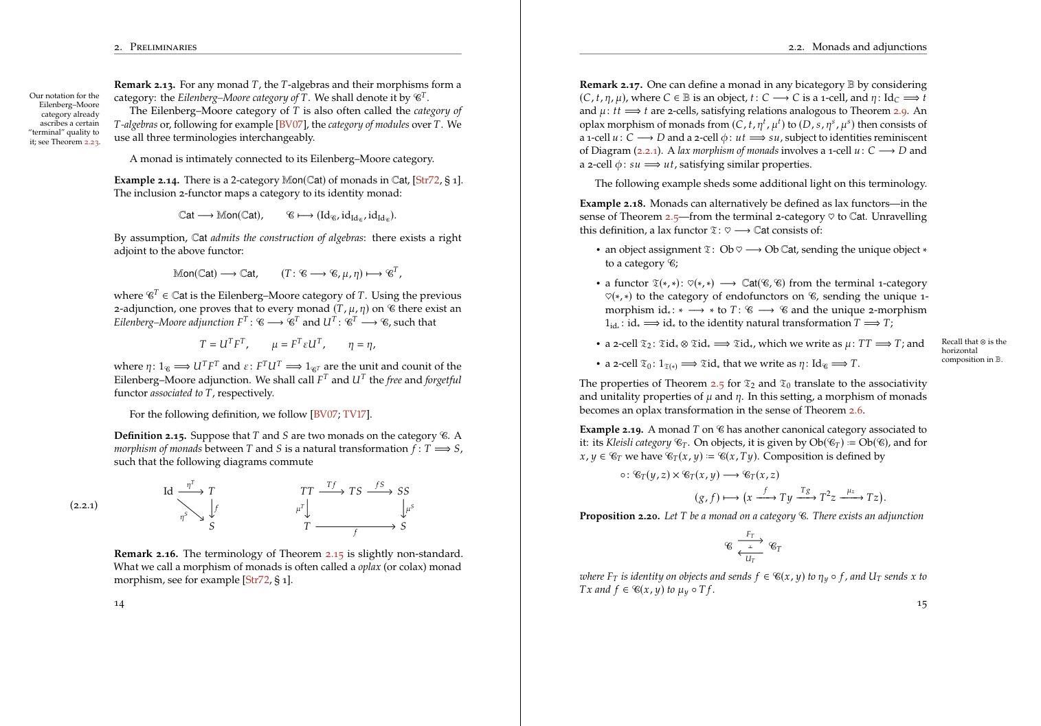
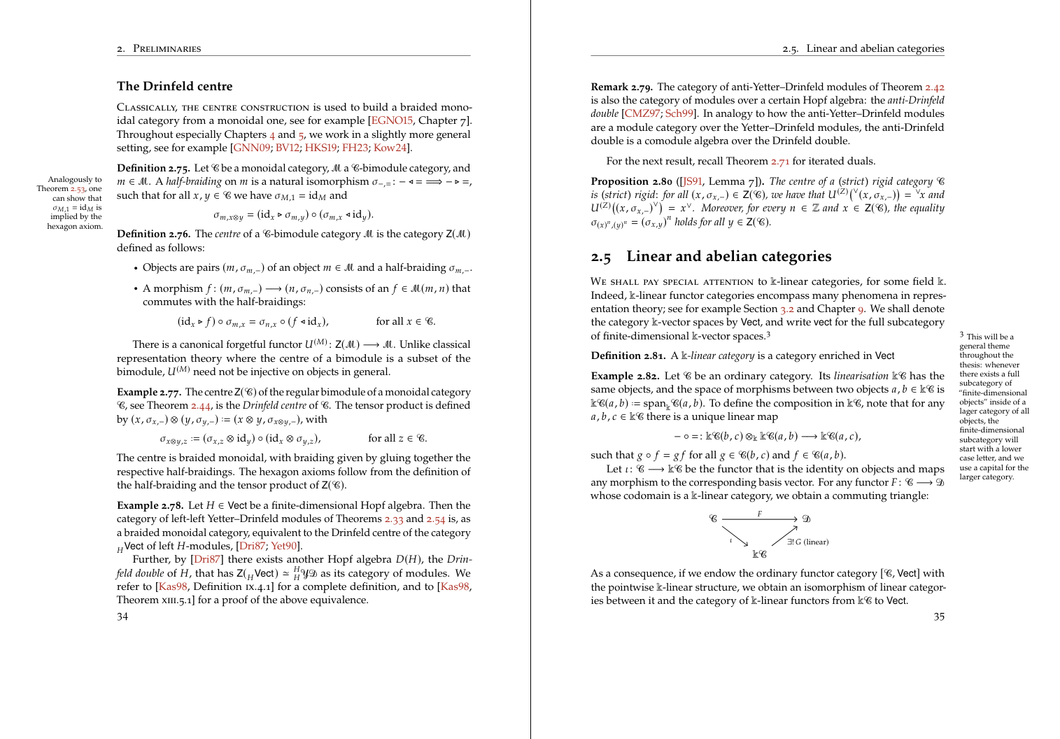
For reference, here are two views of the finished dissertation. Each preview links to its two-page PDF, just as it does in the original.
The white page images are intentionally undecorated: no frame, shadow, padding, or invented caption. Their paper edges provide all the separation they need from the dark reading surface.
A long mathematical document needs structure before it needs ornament. The useful choice is therefore the class that makes chapter openings, running matter, notes, and page geometry easiest to control. The images below are less about a particular piece of software than about keeping those decisions coherent from one page to the next.
In this reconstruction, Typst remains responsible for authoring and semantic HTML. Rust adds stable heading links and validates metadata, while CSS controls only the web reading measure. That division lets native Typst functions and imported packages remain available without surrendering the site’s typography.
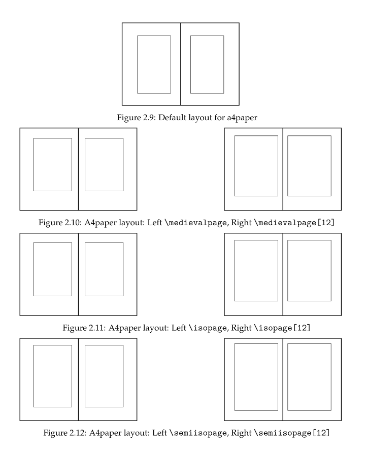
Page geometry changes the character of a book before the reader notices any individual font. A slightly narrower measure gives equations room to breathe while keeping prose lines from becoming exhausting.
The important web analogue is that this tall comparison remains exactly one text column wide. It never trespasses into the sidenote area, so its scale can be read against the prose around it.
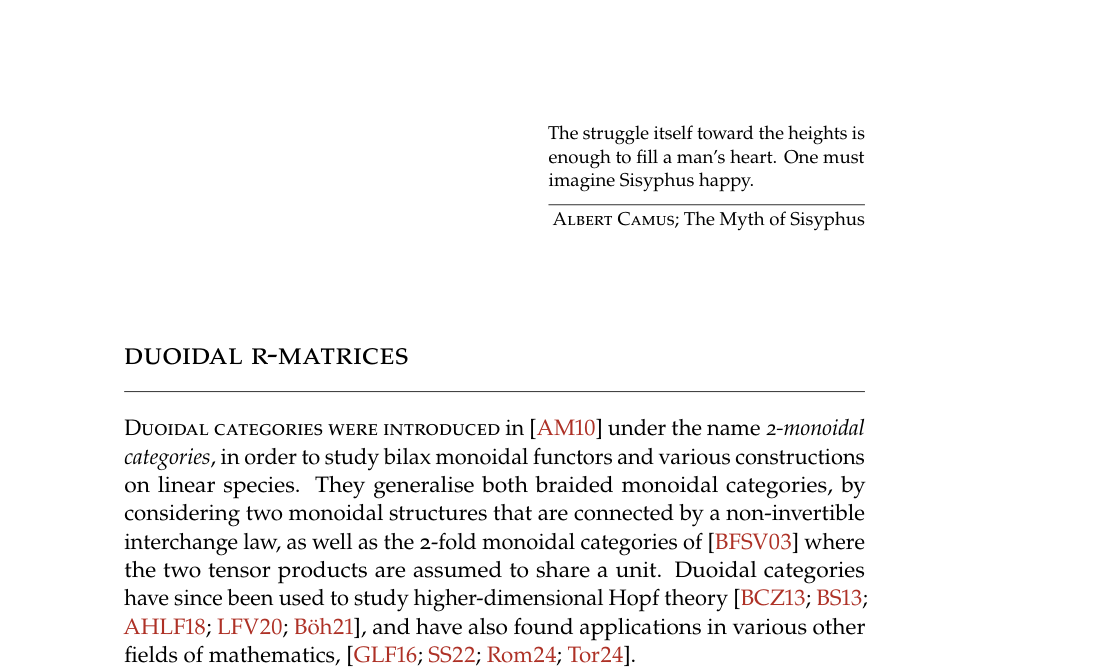
Chapter openings carry more hierarchy than ordinary section headings. The unmodified sample leaves the number out of the composition:
A successful alternative can place a large number in the outer margin, leaving the title aligned with the text block. This uses the page’s empty space as structure rather than filling it with decoration.
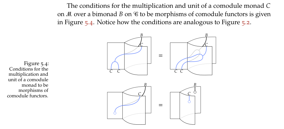
Margin notes work best when they are treated as a second, quieter voice. The next linked spread shows notes alternating with the outside edge of each page.
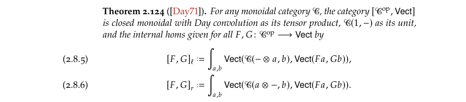
Side captions use the same principle. The figure stays in the primary measure; its explanation occupies the nearby margin without forcing the main text to narrow further.
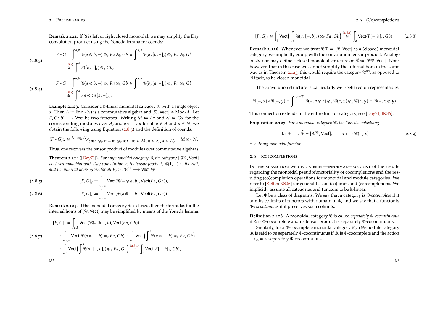
Equation numbers can move outward as well. Compare the conventional placement
with a number placed in the margin:
Across a spread, the labels follow the outside edges of the pages. The preview again grows only to the right on desktop and links to the original PDF.
Alphabet samples are most useful at the size at which they will actually be read. These three strips therefore fill the prose width but retain their very shallow natural proportions.
Text-face comparisons need a little more vertical space, but they use the same rule: scale to the article measure and preserve the image’s aspect ratio.
Small collisions often decide between otherwise excellent typefaces. One italic form reaches uncomfortably into the following calligraphic letter
while the alternative leaves a more convincing interval:
Images may also live inside a sidenote.
Theorem typography is another place where details compound. Upright punctuation can remain distinct from an italic theorem body:
The first treatment keeps structural punctuation upright while the theorem body remains italic: The alternative lets the punctuation follow the surrounding italics:
Microtypographic changes should be quiet enough that a reader feels the improvement before identifying it. Extra space around long dashes is a good example. Here is the unadjusted sample
and the version with a little more air:
Oldstyle numerals are comfortable in prose, but citation labels behave more like compact identifiers. The first sample uses text figures throughout
while the second gives the labels lining numerals:
Finally, repeated theorem references become easier to scan when the theorem number is part of the visible label and remains the link target.
The result is a faithful reconstruction of the reference page’s image grammar: full-measure comparisons, right-expanding linked spreads, and illustrations that can move into the margin when they belong to the secondary voice. All of it is authored from this Typst file and generated as static HTML.
 A successful alternative can place a large number in the outer margin, leaving the title aligned with the text block. This uses the page’s empty space as structure rather than filling it with decoration.
 Equation numbers can move outward as well. Compare the conventional placement
 with a number placed in the margin:
 Across a spread, the labels follow the outside edges of the pages. The preview again grows only to the right on desktop and links to the original PDF.


 Text-face comparisons need a little more vertical space, but they use the same rule: scale to the article measure and preserve the image’s aspect ratio.

 Small collisions often decide between otherwise excellent typefaces. One italic form reaches uncomfortably into the following calligraphic letter
 while the alternative leaves a more convincing interval:
 Images may also live inside a sidenote.
Theorem typography is another place where details compound. Upright punctuation can remain distinct from an italic theorem body:
Images may also live inside a sidenote.
Theorem typography is another place where details compound. Upright punctuation can remain distinct from an italic theorem body:
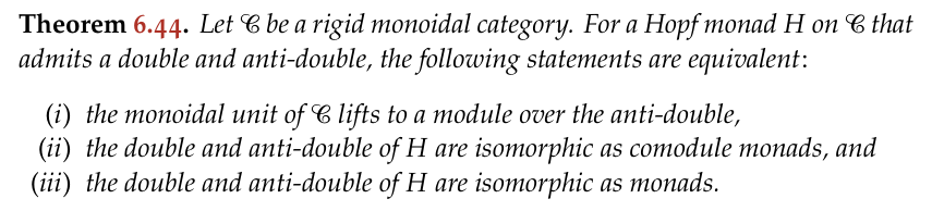 The alternative lets the punctuation follow the surrounding italics: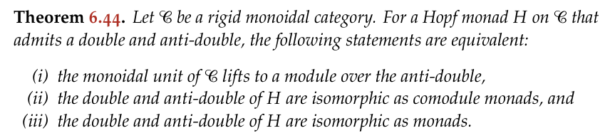
 and the version with a little more air:
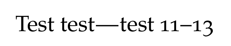 Oldstyle numerals are comfortable in prose, but citation labels behave more like compact identifiers. The first sample uses text figures throughout
 while the second gives the labels lining numerals:
 Finally, repeated theorem references become easier to scan when the theorem number is part of the visible label and remains the link target.
 The result is a faithful reconstruction of the reference page’s image grammar: full-measure comparisons, right-expanding linked spreads, and illustrations that can move into the margin when they belong to the secondary voice. All of it is authored from this Typst file and generated as static HTML.